
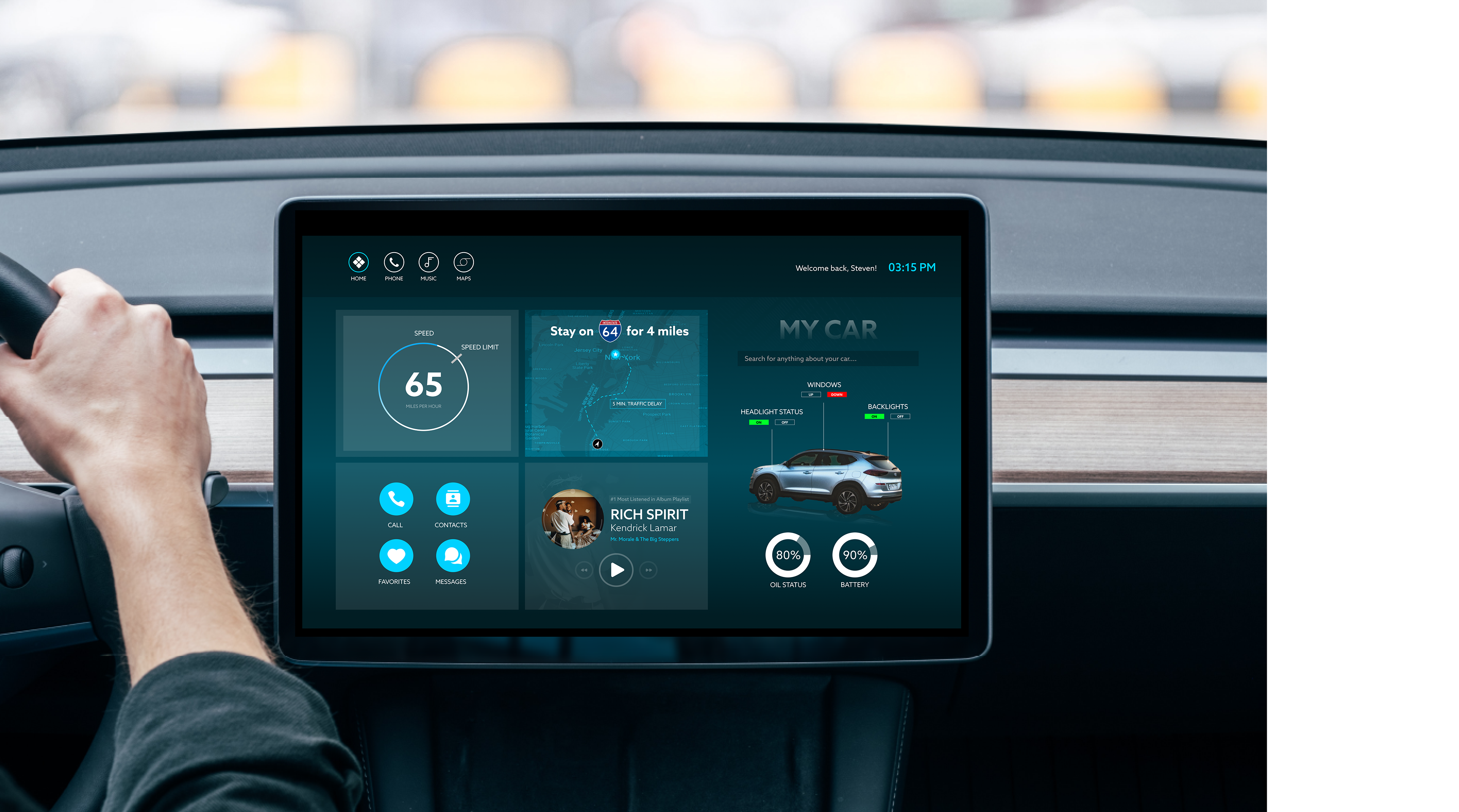
Project Description: Car UI Interface Project
Total Duration: 2 weeks
Programs Used: Figma
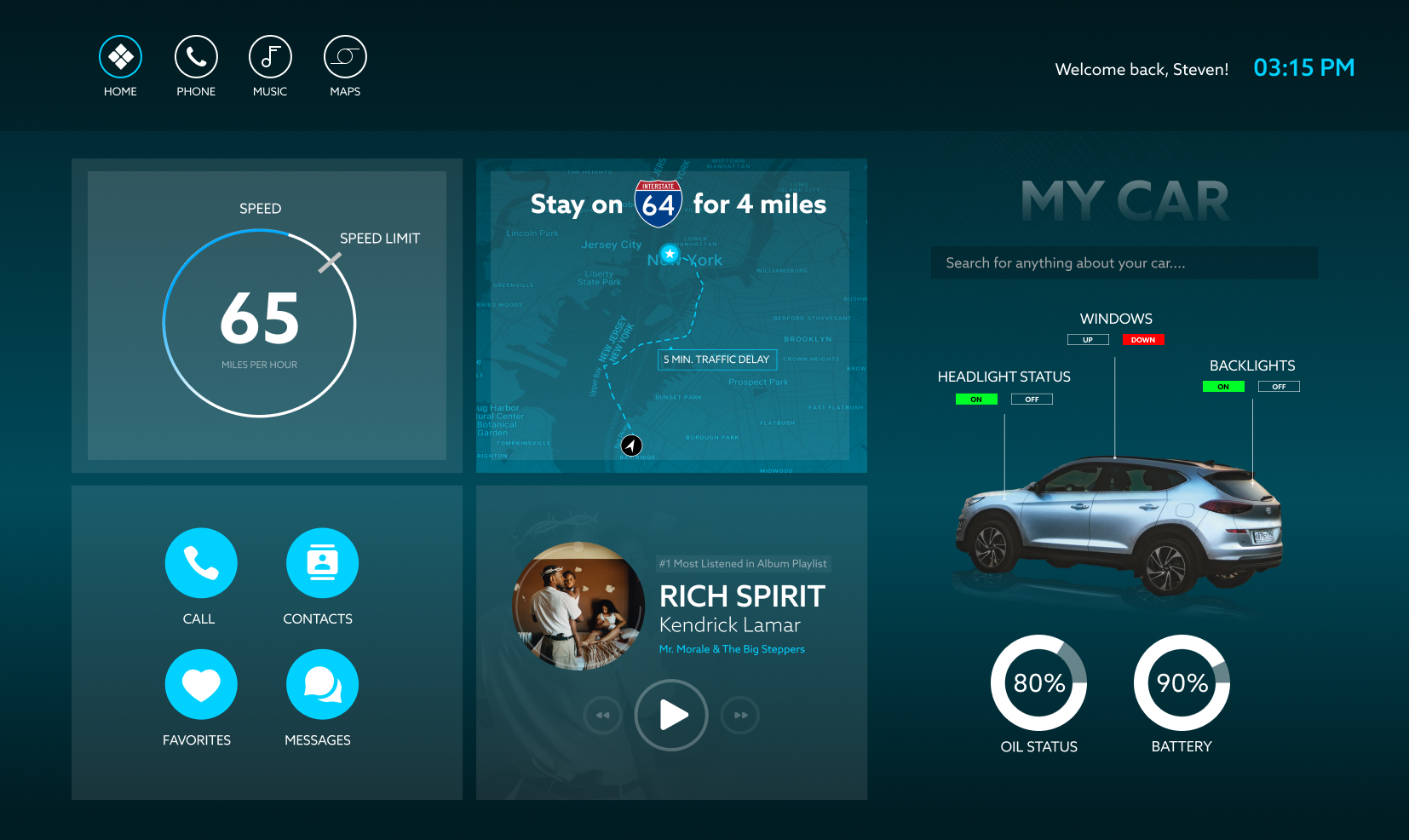
Project Summary: Most in-car tablet UIs feel like they were designed by someone who has never actually driven a car. Too many menus, too many taps, and somehow the one thing you need is always buried three screens deep. This concept tackles that problem by cutting through the noise and putting the most important information front and center. Instead of forcing users to bounce between navigation, music, and car controls, everything is organized into a single, glanceable dashboard. Key driving data like speed, battery, and route info are prioritized, while secondary features stay accessible without getting in the way.
The goal here was simple: make something that actually feels usable while you’re driving. The layout leans on clear hierarchy, large readable data, and just enough interaction to get things done without overthinking it. Features like music, calls, and vehicle controls are easy to reach but don’t compete for attention when you’re focused on the road. It’s a more practical, driver-first approach that trims the unnecessary complexity and makes the experience feel intuitive instead of frustrating.
Home Screen
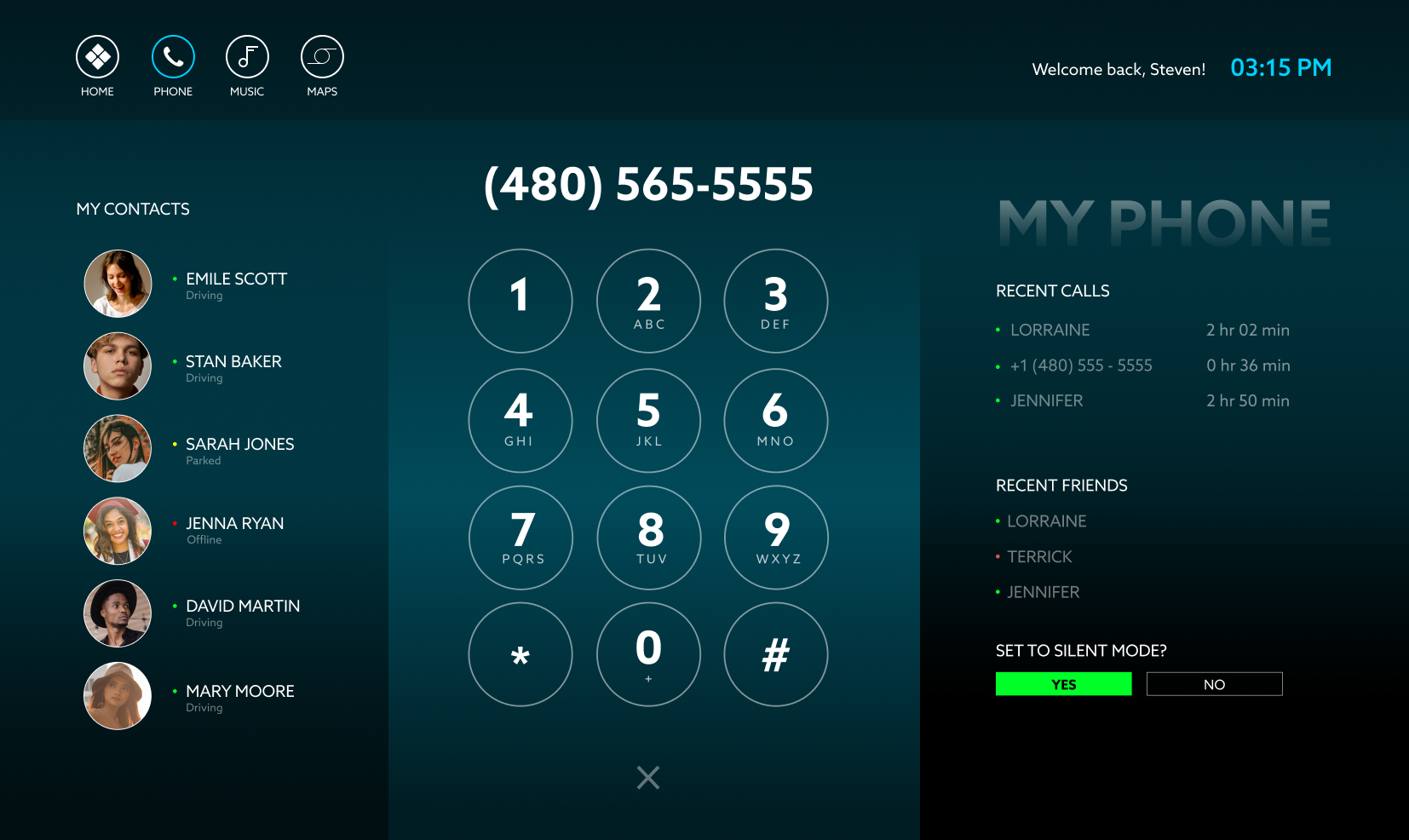
Phone Screen
Music Player
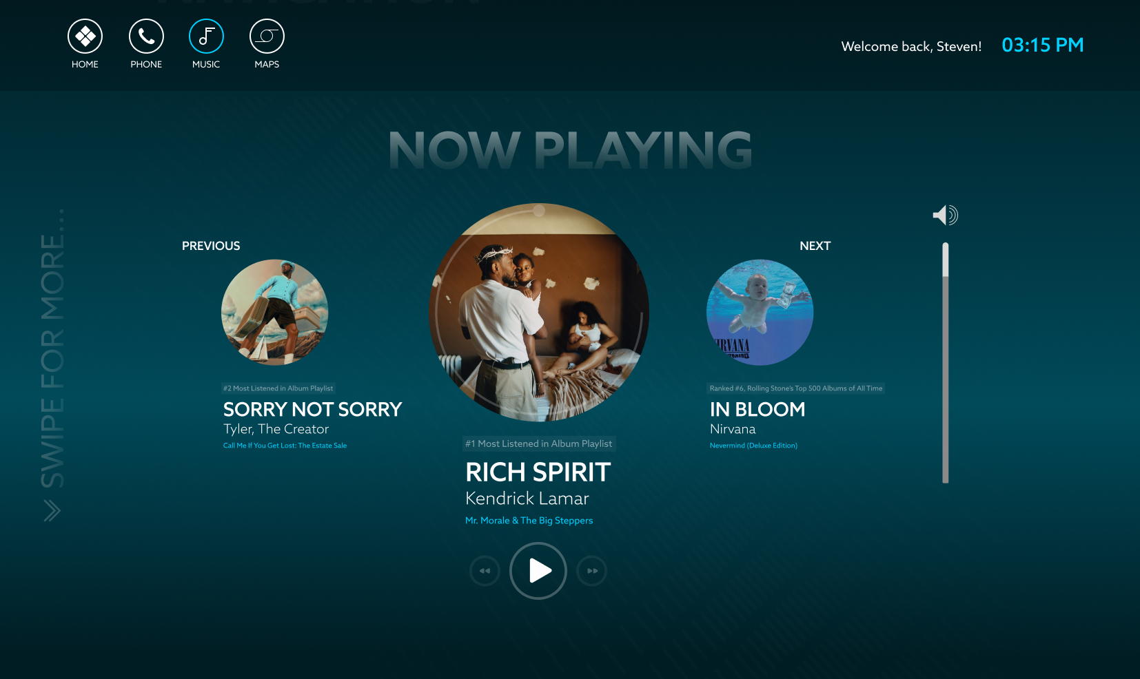
Without Queue Bar
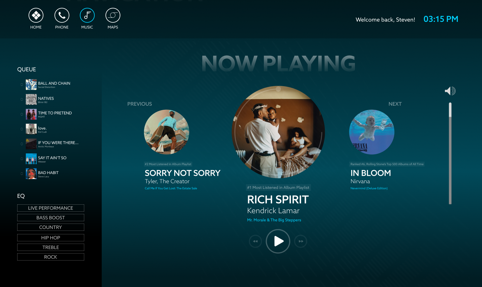
With Queue Bar
Maps Screen
