
This project was conducted by Victor Johnson, Dustin Howarth, and Steven Le for the GIT340 course in Research and Usability.
Objective: Find usability and functionality issues on the Taco Bell website while also gathering feedback from real users.
Using evaluations, information architecture, personas, surveys, and various assessments, our team created a new design for the Taco Bell website based on our collected data and feedback.
Methodology
The criteria for the usability testing was based off of:
• User Research
• Our findings
• Test scenarios
• Computer skills & difficulties
• Navigation speed
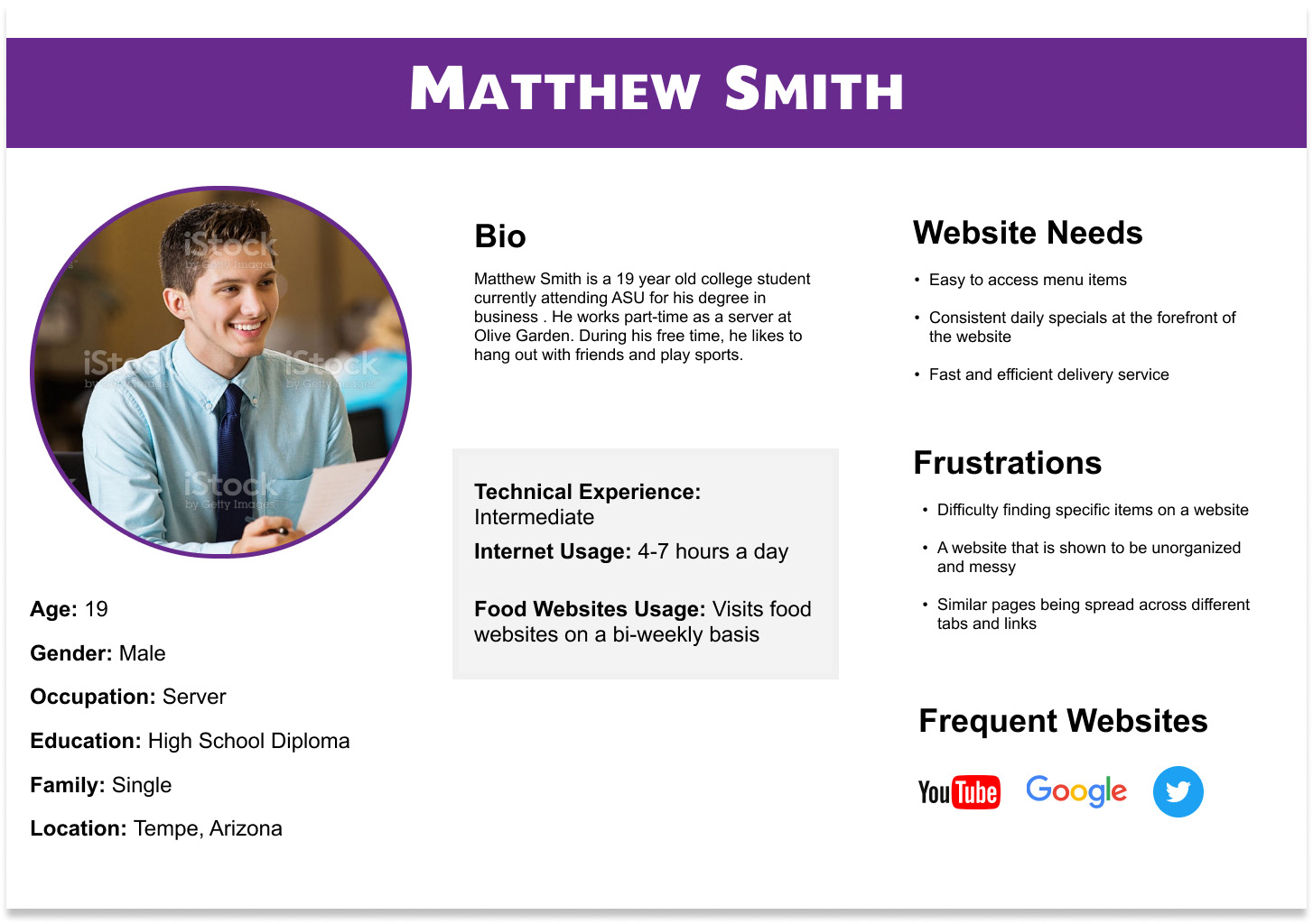
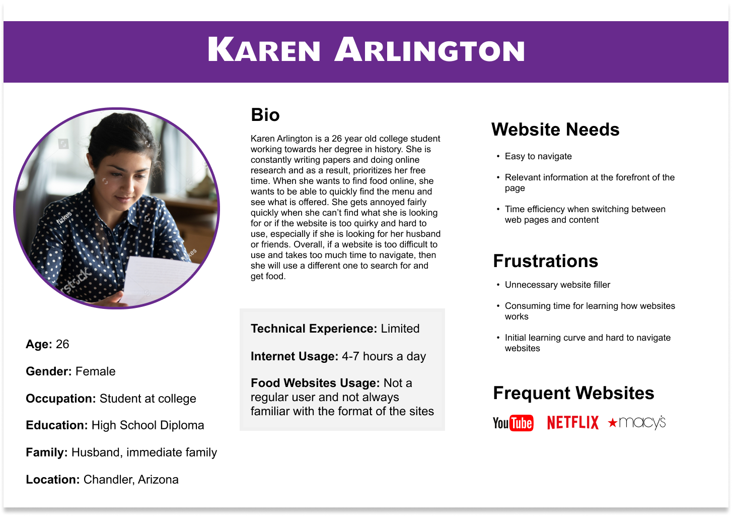
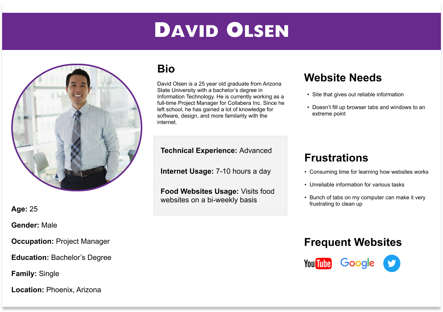
Personas
Testing
We created and tested our participants with three different scenarios so we can estimate the average time it may take them to complete these following tasks:
Scenario 1:
You are a student at ASU and you are hungry for Taco Bell tacos and burritos. You need to order food online and have it made at a Taco Bell.
Tasks:
1. Order three regular crunchy shell tacos and one Quesarito. Add the items to the cart.
2. Check out the ordered items (if any), stop when you reach the payment screen.
3. Browse the Taco Bell locations and select any location of your choosing.
Scenario 2:
You are a businessman trying to learn more about Taco Bell and its career opportunities.
Tasks:
1. Find the educational benefits Taco Bell offers its workers.
2. Find out what Taco Bell's mission statement is with their employees.
3. Find out how to get a Taco Bell franchise.
Scenario 3:
You are a student looking for Taco Bell gifts to give to friends for Christmas.
Tasks:
1. Find the price of the Taco Bell Cravings Joggers.
2. Find the price of a Champagne glass set and a sauce packet bowtie.
3. Find the price of the sauce packet balloon set.
Data Analysis
A data analysis was conducted based off of the failure/success rates of the tasks, reoccurring patterns, and the quantitative/qualitative analysis results.
Quantitative Analysis
Qualitative Analysis
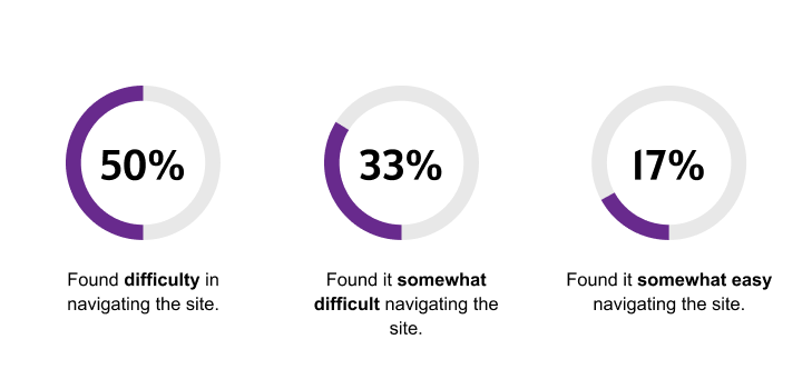
• 5 out of the 6 testers failed to find Taco Bell’s mission statement concerning employees as most searched the About Us page.
• Taco Bell’s mission statement also required a lot of reading through the pages, as many users took too much time reading the blocks of text.
• Users had difficulty finding the educational benefits page, as it took them an average of 55 seconds to complete the task.
• 2 of the 6 users, both of whom were over the age of 40, had difficulties ordering the food online as it took them an average of 62 seconds to complete the order.
Heuristic Evaluation
The team conducted a heuristic evaluation for the usability of the Taco Bell website's Home Page, Trust & Credibility, Navigation & IA, Writing & Content Quality, and Page Layout & Visual Design.
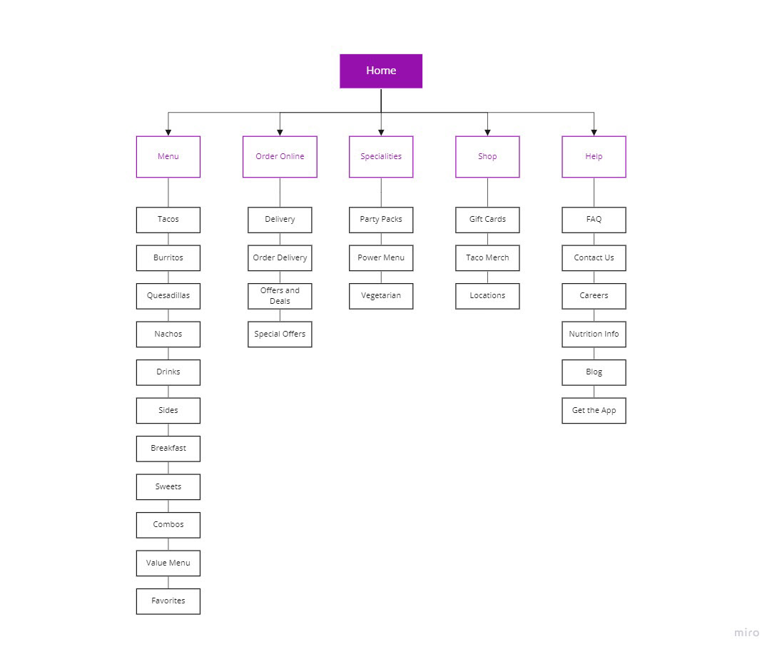
Information Architecture
Reflecting on the feedback that we were given through the evaluation, we decided to take a different approach in the organization of the website menu items. Using Optimal Workshop and Miro, we separated each of the elements depending on ease of access, as well as which category they fit the most in.
Post-research Recommendations
The pages of the website ended up being too long and wordy for the users. In order to compromise on this issue, the team decided that the best idea was to limit word usage and use more graphics or visualization. One of the key findings was that the length of a page affected how long it took to complete a task.
There was a lot of filler text and categories in the navigation bar, so changing the navigation to more direct categories can save the user more time getting to their end goal.
Loading time on each page and their elements could also be improved drastically. The more time a page took to load, the longer it took the user to succeed in the testing. In order for loading time to decrease, reducing the amount of content on each page can help speed the website up a lot more, resulting in faster result times.