HOW DID I DESIGN THIS?
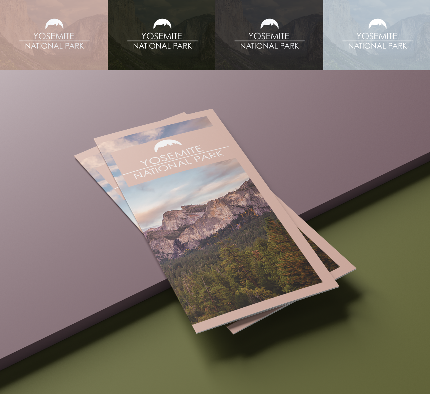
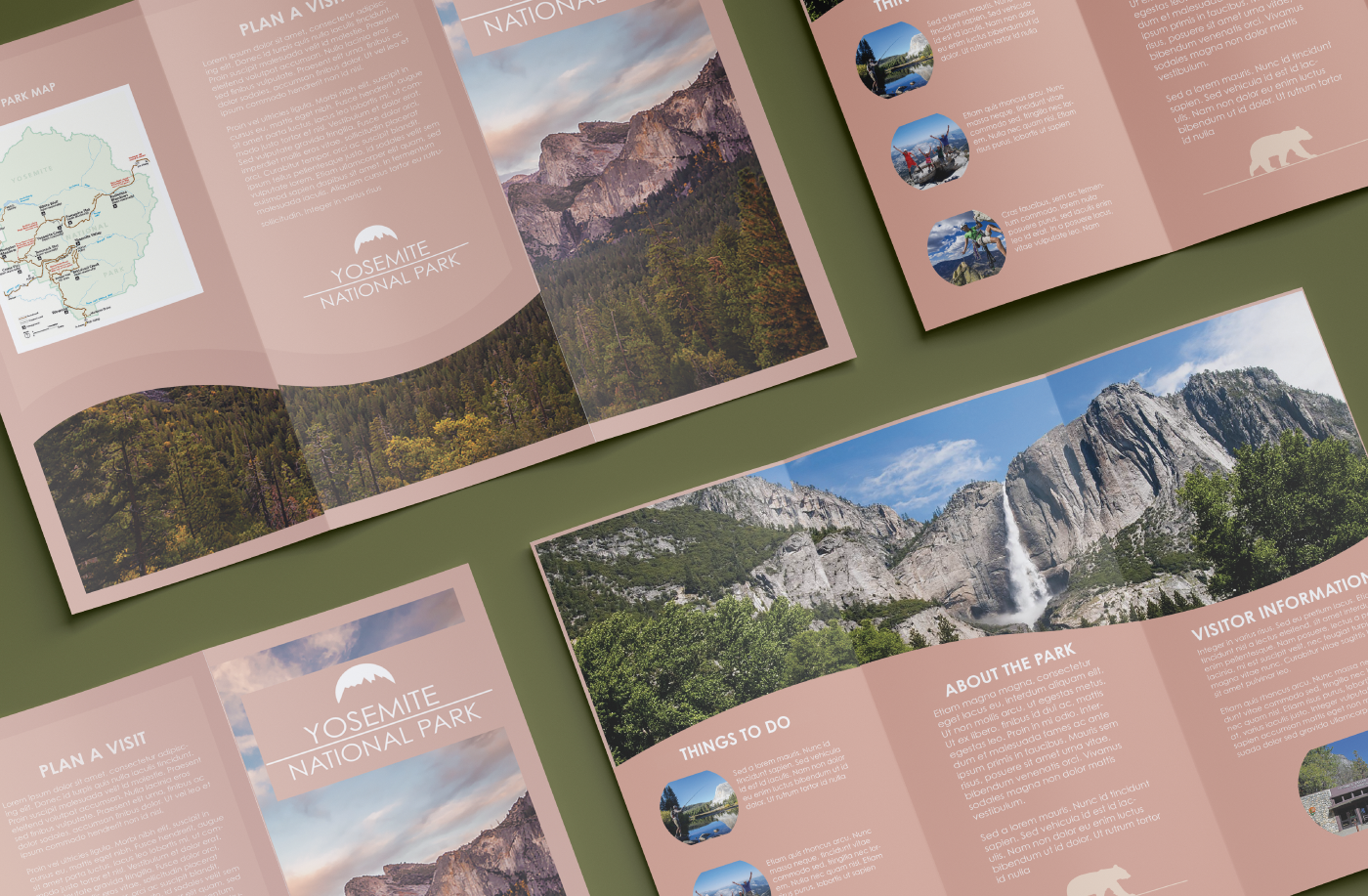
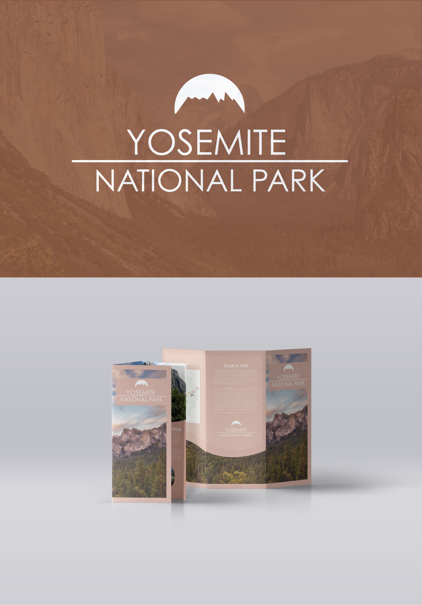
For this brochure, I wanted to take the viewer on a journey. I know when I want to go on a vacation, I want to see a brochure that takes me for a trip, even if that is with a brochure that is handed to you. I created the wavy extension of the view photo on the front, and I placed it at the bottom throughout the different pages to show continuity and familiarization with each page. I wanted there to be a theme, but I didn't want the theme to take over the information that is being presented. With that being said, I separated the brochure into two color schemes. One being the colors of the sky, trees and nature around the mountain, and another of the actual mountain. Once that is noticed, you see the pink color that I chose is in relation with the mountaintop, which lets everything blend together.