
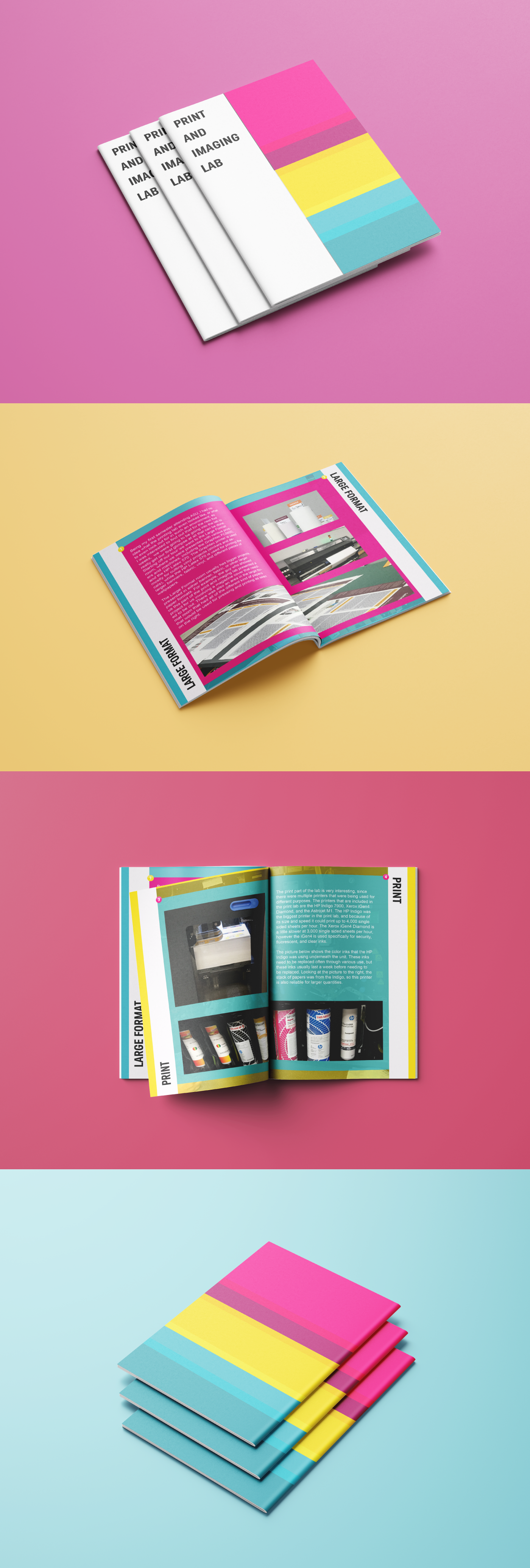
HOW DID I DESIGN THIS?
When making a booklet, the number one priority for me was the layout. The colors have just as much of an impact, but if your layout is too cluttered with nothing going on, the viewers are not going to catch on. With that in mind, I designed this booklet utilizing shapes and borders, the most useful and effective way to group and organize a page. I noticed that the text was being blended in too much with the pictures that I had taken prior, but I found that once I used the shapes to give each element a look of its own, it helped guide the viewer's attention to read the text right away. I believe this is really beneficial, because without reading the text on each page, what are the pictures really for? The pictures and the text have a working relationship, the text just allows the viewer to understand quicker.