
Project: Trailviews App Case Study
Duration: 5 Weeks
Problem: Whether it is going out of town or finding places nearby, the process of finding new areas to hike can become time-consuming. The user may end up having multiple pages open with different locations and mountains recommended to them from different articles. There is a lack of one interface or network that puts all this information right in front of the user.
Solution: Creating an application that places all hiking trails together based on difficulty, location, popularity, and friends.
Design Process
• User Research
• Personas
• Sketches/Wireframes
• Prototypes
Target Demographic
The intended audience for this application is mainly towards individuals who love to hike and visit different natural environments. This can be done at any age, however this app mainly appeals to the 18-35 age range that has more experience with using applications for different social networks.
User Research
Number of Participants: 16
We conducted a survey based on how each individual acquires their information when looking for a place to hike.
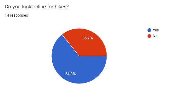
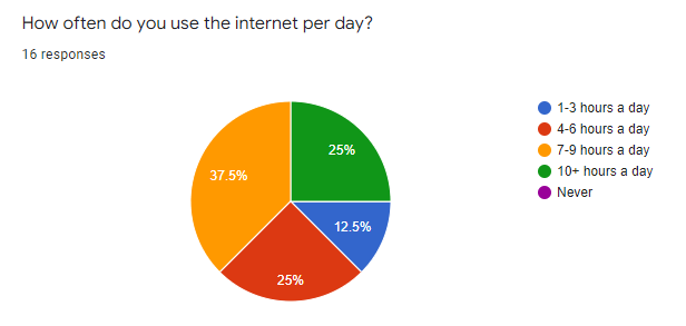
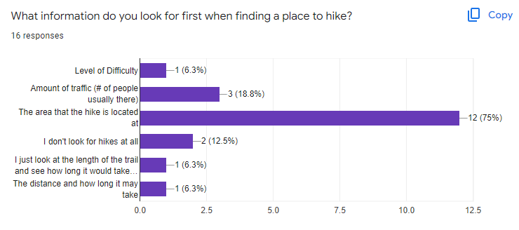
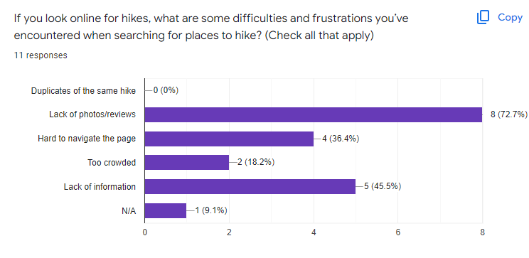
Reflecting the results of our surveys, we were able to gather the following information:
- 43.8% of participants get their hiking locations from friend recommendations.
- 37.5% of participants use the internet 7-9 hours a day.
- 25% of participants visit websites with nature & hiking content 1-2 times per week.
Empathy Maps
Based off of our results, we created a couple of empathy maps to gather an idea of two perspectives from two different personas. We separated each persona based off what the users might:
• Say & Do
• Think & Feel
• See
• Hear
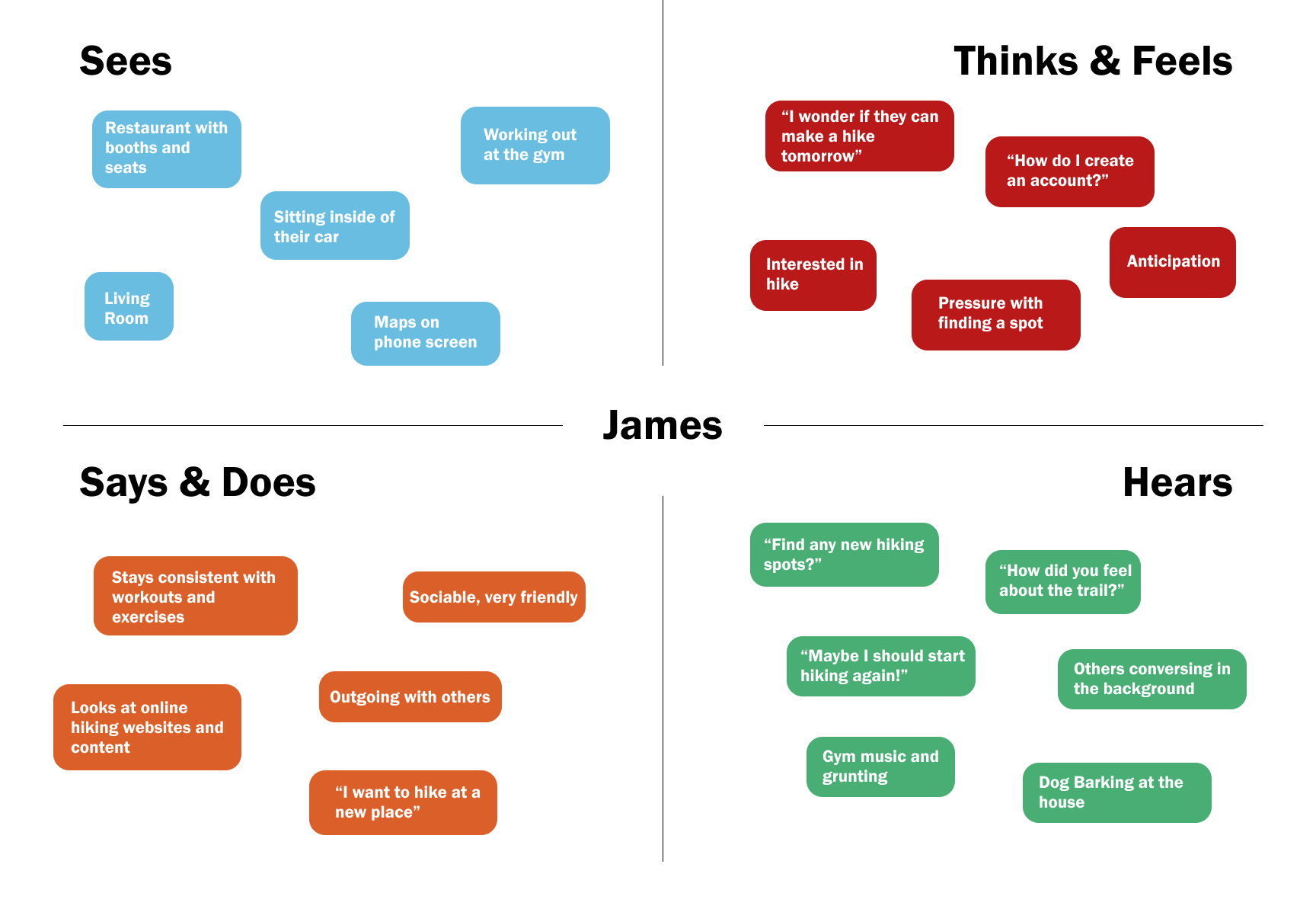
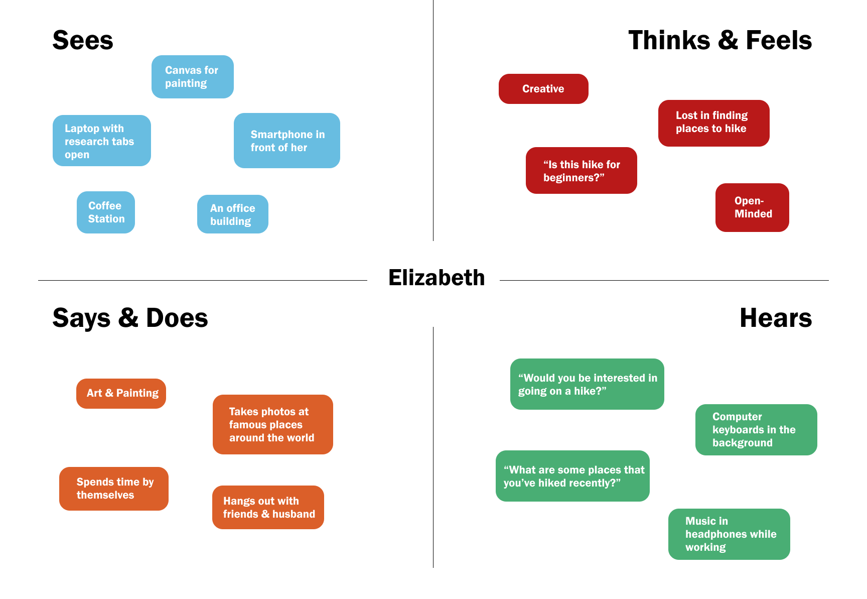
After creating the empathy maps, we used our testing analysis to craft a page and biography for both personas to create a clear view of what approach the user might take when downloading and using the application.
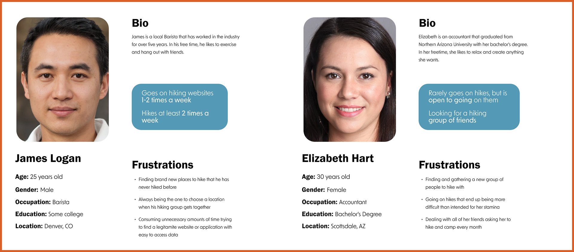
Personas
Sketches
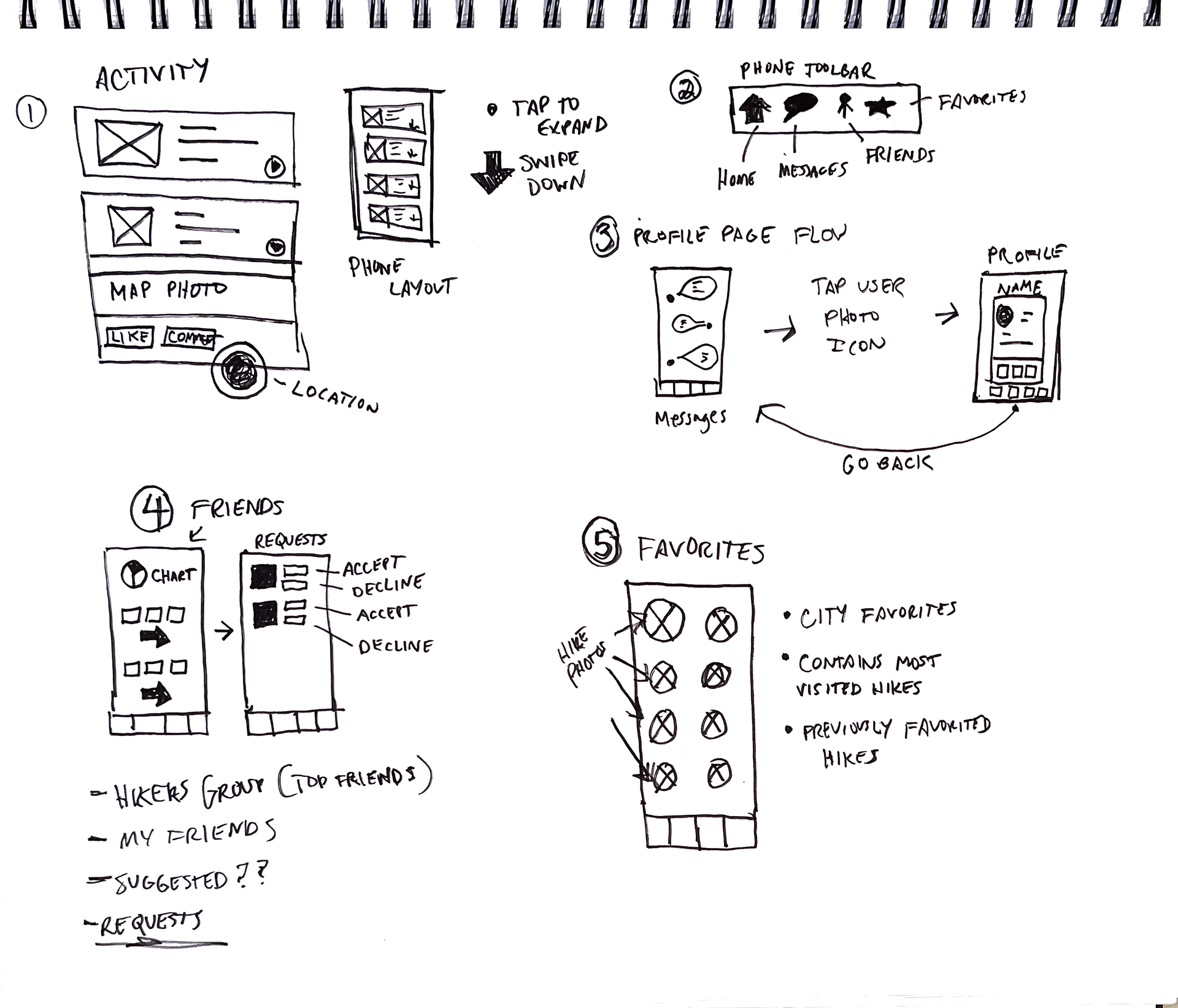
We started out with early sketches of the features of the application alongside the navigation toolbar and basic interactions. Numbered by page, the sketches go over the purpose of what makes each page unique to one another. Through starting these drawings, we decided we wanted to put accessibility in the forefront, and slowly add features as we gained more understanding.
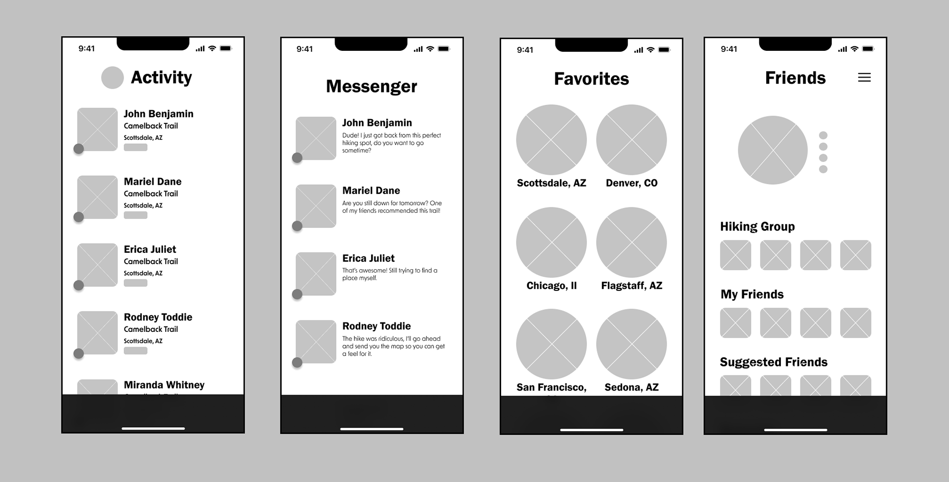
After crafting the general sketches and layouts, we then started working on wireframes to adapt an idea of how the application will look when used from the smartphone screen itself.
Since a lot of the users have history struggling with navigating different pages from previous experiences, the overall aim for this interface is to not overwhelm the user with unnecessary features, and to keep it clean and straight-forward.
Wireframes
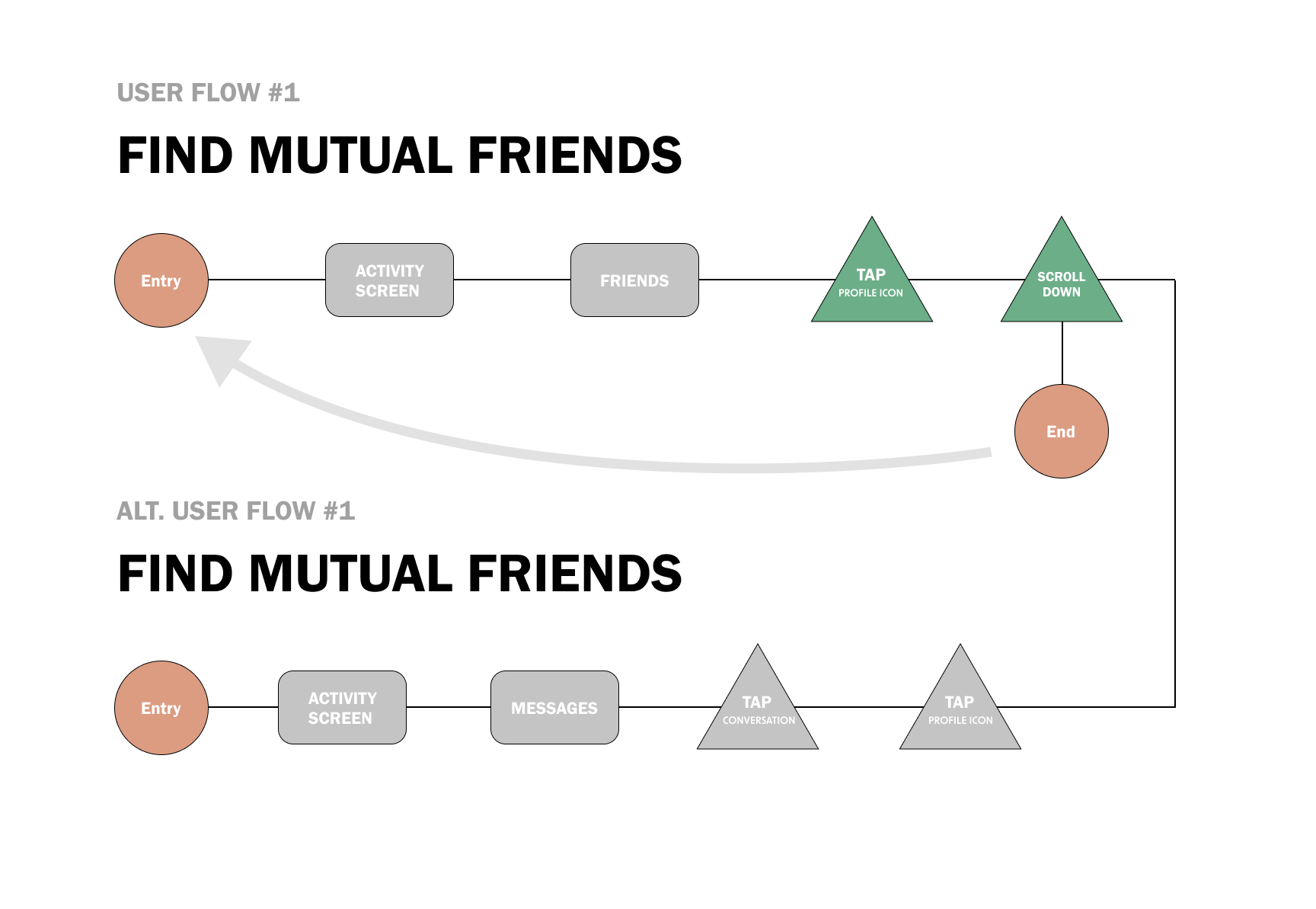
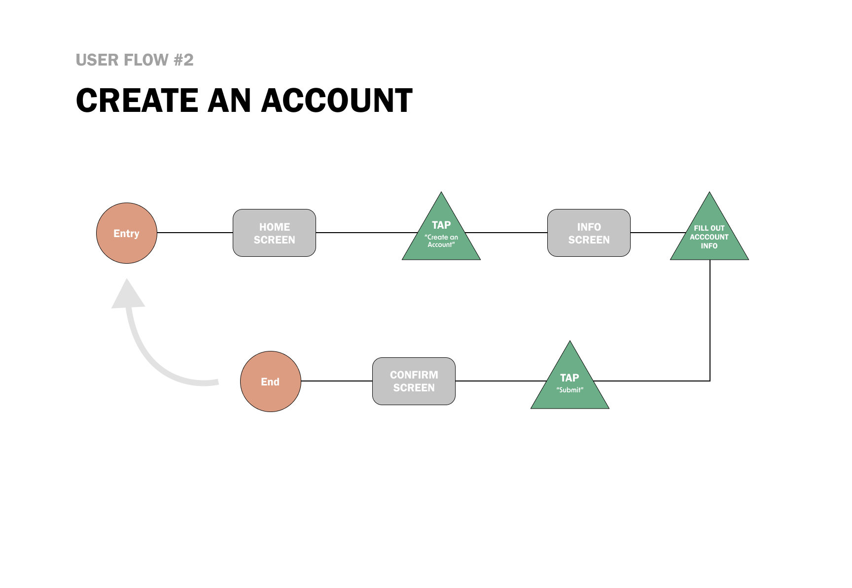
User Flows
Before the app prototype was officially created, we made a couple of different examples of how the user might navigate through a couple of different tasks. These different tasks are relatable to the personas that were created above, so we could be more personal and relatable with the users that might be navigating through the app.
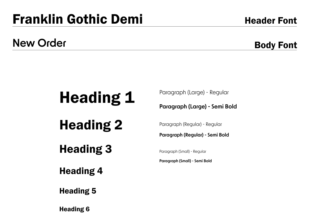
Styling Guide

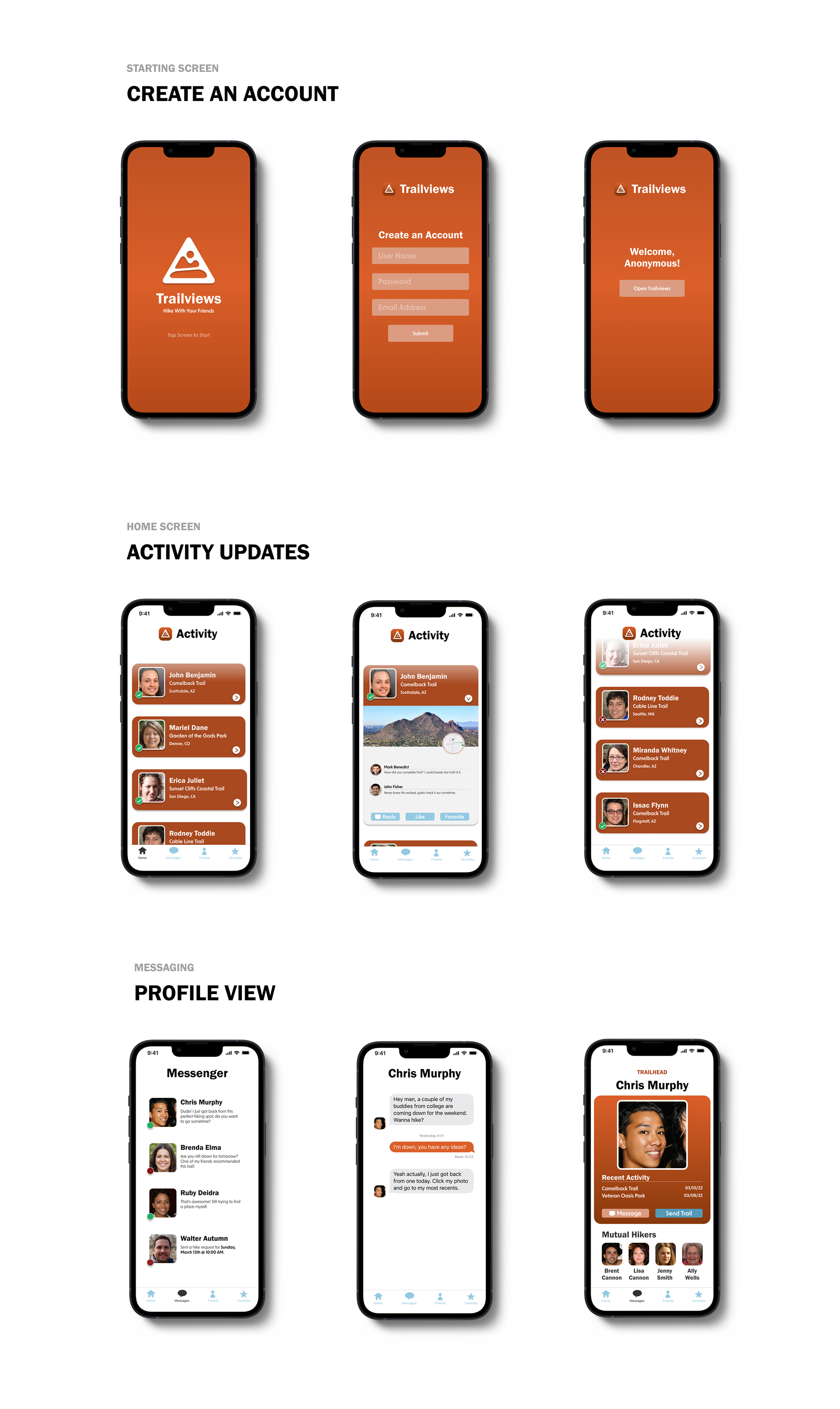
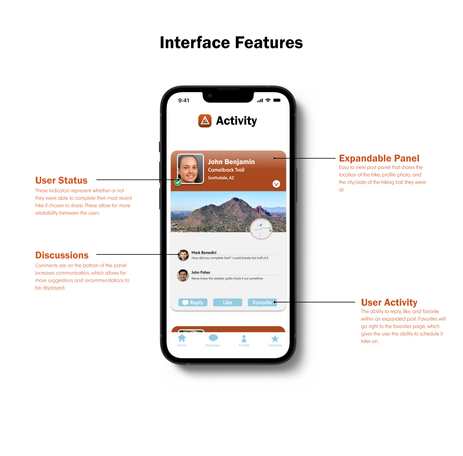
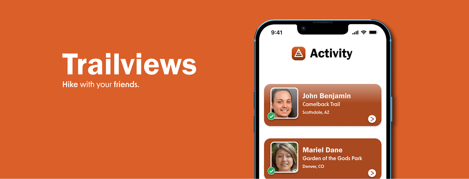
Final Product
After gathering research, creating wireframes, and meeting all objectives that were given for the app, the final product was able to correlate with all of the issues and inconsistencies that affected the relationship between the interactions and the users.
Thoughts
With a new kind of application like Trailviews, results and users change as time moves on, so there will never be a final product. If there was more time spent on the functionality and look of this application, I believe adding more discoverability would benefit the user to find more people and hikes around the area that fit their personalities. The ultimate goal was to fuse the idea of social networking and hiking trails, and we believe we were able to create a solution for a wide range of potential users.
Click here to view the final prototype.